
Ad Age
MullenLowe's Octopus is Running Wild
João Paz, design lead on the project, explains the move to a more modern, abstract and flexible identity
2023-06-05
The octopus felt dated. But the idea of the octopus still felt fresh.
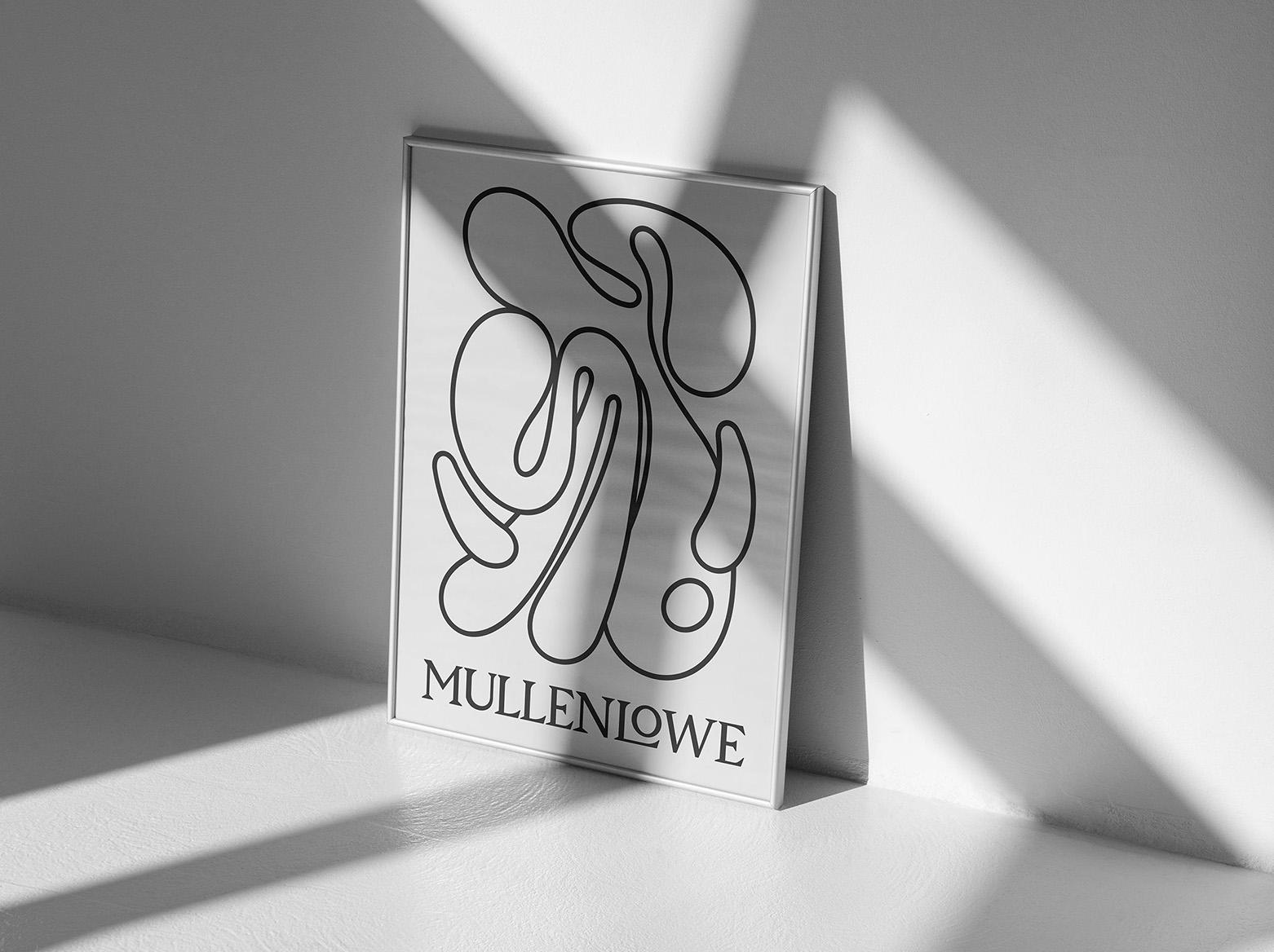
That was the starting point at MullenLowe, a year ago, as it embarked on a total redesign of its brand identity. The project reached the finish line Monday, as a striking new logo—actually, a collection of flexible and adaptable logos—rolled out to the 4,000 employees across the agency’s global network.
And quite the radical change it is.
In place of the more realistic-looking “Challenger Octopus” illustration (seen below), used since a previous rebrand in 2016, the agency has developed a wildly abstract and fluid octopus design rendered in dozens of versions—and which will soon be available to employees to twist and stretch into their own personalized octopi as well.
The case study video gives an overview of the design system, which also includes a more staid-looking serif wordmark to balance out the wildness of the logo.
João Paz, head of design at MullenLowe U.S., led the project. He told Ad Age that the octopus—with its famed intelligence and bizarre genetic abilities of reinvention—was still a great symbol for a creative company. But the “Challenger Octopus” had begun to feel dated.
“It has this kind of masculine vibe of being punchy, punching above your weight. We felt it didn't really represent us anymore,” he said. “That was kind of the brief—it felt like MullenLowe was showing up feeling a little old. So we took that brief to heart and created a new logo that broke from everything. That was the challenge—to break free from the corporate agency world.”
They decided the logo needed to be more dynamic, with more of a sense of movement and reinvention. They achieved this in two ways—first, by creating the more abstract, free-flowing design; and second, by expressing the design in lots of forms rather than a single static image.
The 26 versions below—black-on-white, as well as white-on-black—show the range of expressions. (The logo doesn’t use any color, at least for now. The agency tested color versions, but said black-and-white always felt stronger.)
Below is how the logo looks next to the wordmark, which Paz described as the emotional meets the rational—refecting both sides of the creative process.
Eventually, they took the thinking about multiple logos to its natural conclusion—what if there could be an infinite number? So they developed an app, which is forthcoming, that will allow employees to create their own unique mark to use on business cards and email signatures. (Personalized agency logos are having a bit of a moment—see David’s recent take on the idea.)
“You can expand the tentacles, twist it, twirl it around to create your own expression of it,” said Paz. “That will lead to a library of octopuses [in the app] you can click on and see the name of the person that created each one. So, everyone can be a designer for a day and express their own version.”
Lu Borges, head of brand and communications at MullenLowe U.S., said this interactivity and inclusivity was particularly intriguing to the staff at the unveiling. “Staff is often overlooked in projects like these,” she said. “This just makes them feel part of something bigger.”
Defining the agency under a new CEO
Paz and Borges said the project went into overdrive when Kristen Cavallo, CEO of fellow Interpublic Group shop The Martin Agency, took on the additional role of global CEO of MullenLowe Group last November. Cavallo was looking to better understand MullenLowe herself, and embraced the project, encouraging the designers to push it further, they said.
“There's an opportunity here to do something that will demonstrate our level of craft, our design capability and how this agency is different,” said Borges. “You can attract clients by building a case study off your own brand.”
“MullenLowe is not Wieden+Kennedy. We can't just say ‘This is our work’ and have the world automatically look at it,” added Paz. “We need to make a point in the way we show up. Through our visual identity, we need to make an impression.”
The project has additional offshoots, as well—including a custom font (above) created by combining the octopus design with the wordmark design. They’re also excited about the possibilities for merch and are making everything from tote bags to hoodies.
As a final exercise, the agency challenged its creatives around the world to come up with copy lines—around themes of inquisitiveness and “positive dissatisfaction”—to pair with the logo on posters that will be displayed in the agency offices. This will help further distill the agency’s new positioning.
Among the lines that emerged from that task: “If it doesn't move you, move on,” “Always being responsible is irresponsible,” “Find some heels to nip” and “Hide the safe slide.”
On the whole, the agency hopes the refresh pays dividends internally and externally—as both an example of its creativity chops and a rallying cry for how it wants to be seen by clients and talent alike.
“It was a labor of love,” said Paz. “We’ve gotten to something we’re really proud of. We were like, ‘You know, let’s show Collins and Pentagram that we can do it, too.’”
“We're excited to turn the page and start fresh,” Borges added. “We see a lot of agencies consolidating and merging under umbrellas that don’t necessarily have that distinctive tissue anymore. We’re trying to fuel what we think this agency means, and what we want looking ahead.”
This article was originally published on Ad Age.