
Adweek
MullenLowe Rebrands With a Reimagined Octopus
The new branding is part of a new direction for the IPG agency
2023-06-05
Keith Haring would have admired MullenLowe’s revised branding. The new version of the agency’s octopus logo is reminiscent of the late Haring’s fluid, simple street art. But MullenLowe’s new logo design has a purpose beyond just looking cool. It lets the agency stand out with an individuality that isn’t seen much within holding company agencies.
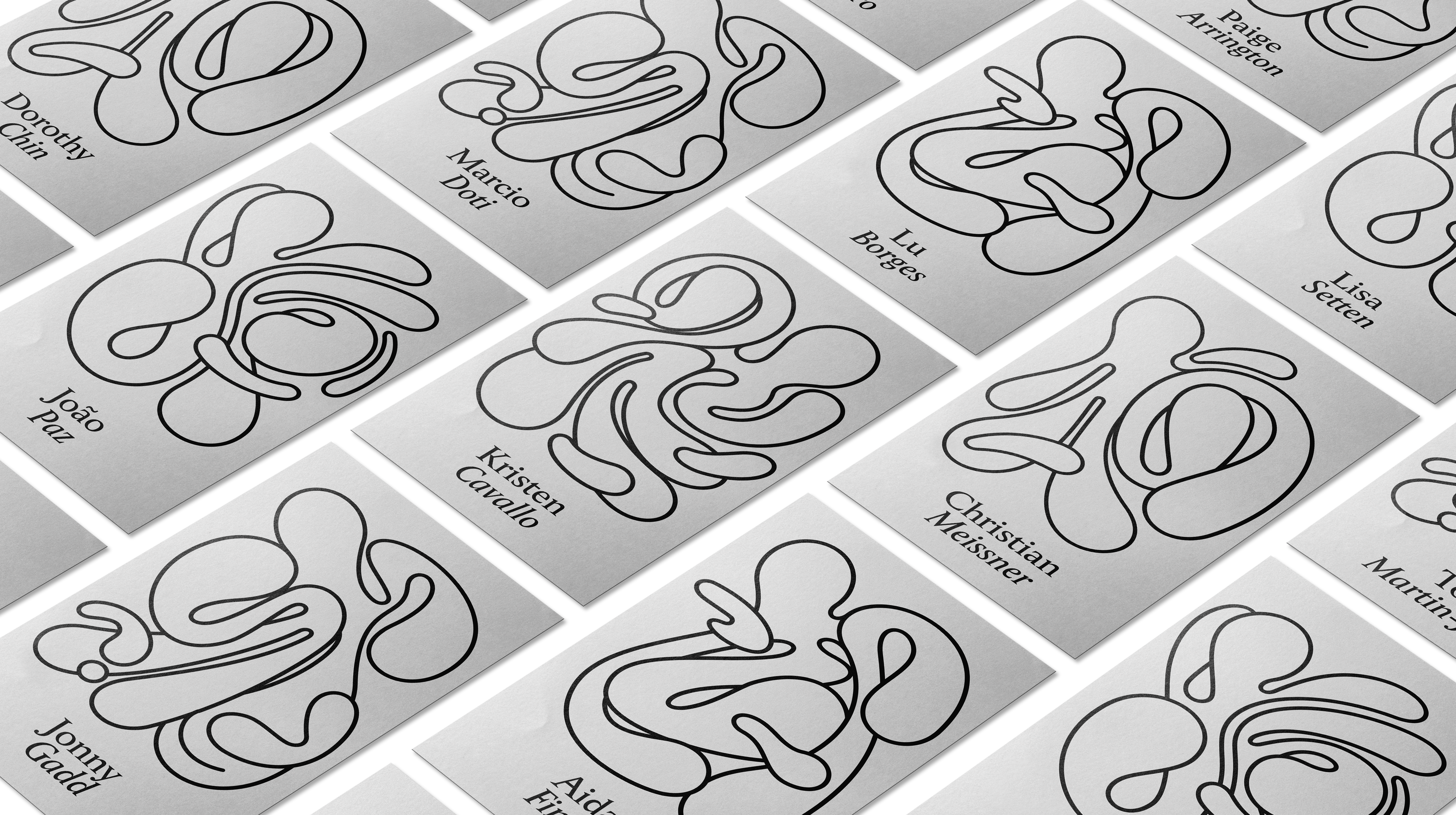
That individuality flows down to MullenLowe’s employees, who can take the new design and make it their own for their business cards and personal profiles.
The new branding has been embraced globally by MullenLowe, which sought to refresh its look under CEO Kristen Cavallo, who has ushered in a new era at the IPG agency network with wins that have included the USGA and KFC.
“The brief was, how can we move away from the feel of the corporate world?” Joao Paz, head of design at MullenLowe told Adweek, adding that the team saw what other agencies were putting out in the world and decided to go in a different, less corporate feeling direction.
How it started and how it’s going
The octopus has been the symbol of MullenLowe since agencies Mullen and Lowe merged in 2015. The original octopus design was hulking eight-limbed creature with boxing gloves. Paz said that some found it aggressive and masculine, and Spanish office Lola MullenLowe changed it to a more graphic representation, which was adopted by most of the network. But Paz said that the revised symbol still didn’t do justice to the creature, so they decided to play with the design.
“We pivoted from a little mascot towards something that is more of an artistic expression and it conveys a lot more of what we believe. It’s fluid and it breaks all kinds of symmetry but it has its own style,” said Paz.
The idea of fluidity took hold, to connote that the agency is constantly challenging itself to be better. The team came up with a concept that the logo should reinvent itself all the time, so it designed a full array of variations of the logo. With no corners or end points, it changes and moves and behaves in different ways.
The visual ID was only intended to be the logo for the U.S., but when it was shared with the global leads, they decided to take the design globally.
“Our mascot offers the perfect metaphor. The octopus has survived over 300 million years precisely because of its fluidity and ability to adapt. It is the only organism that routinely self-edits its own DNA—a model for how brands should behave today,” said Cavallo in a statement.
While the logo design will lead the way, the team also decided to make a new wordmark as well, so it came up with a stark contrast to the octopus, firm in its Serif treatment. It is meant to ground the funkiness of the octopus and pay tribute to the past and the agency’s heritage.
Getting personalized
There are not only multiple versions of the octopus logo, both vertical and horizontal treatments, but the agency is allowing people to make it their own.
MullenLowe has invited its more than 4,000 employees globally to design their own octopus using a generative app. “We want the design system to reflect who we are and allow each person who’s part of MullenLowe to make their own mark,” said Paz.
It allows users to customize the octopus for email signatures, social and profile icons, and even the background of an Apple Watch.
To complete the visual identity, the system includes its own trademarked typographical treatment. The octopus’s tentacles morph into letters and numbers that create a full typeface, including numerals.
The logo will be displayed across office walls will include swag.
“This is more than just a logo redesign. We have a point of view on how brands grow, and we built our identity and voice to reflect that belief. In a rapidly changing world, more of the same is not the path to long-term success. Brands need to earn and continually defend their unfair share of attention,” said Cavallo. “Products might be boring, but brands can never afford to be.”
This article was originally published on Adweek.